
Interior Designer Bios: 10 About Pages That Win Clients (and How to Write Yours)
%20by%20Ernest%20Meissonier.avif)
Your portfolio earns a visitor's attention. Your About page decides whether they call. Watch the analytics for almost any design studio and the same pattern appears: a prospective client moves from a project they love to the About page, stays longer there than anywhere else on the site, and either opens the inquiry form or quietly closes the tab. The page carries more weight than nearly anything else you publish, and most designers give it less thought than a cushion scheme.
The short version: a strong interior designer bio does three jobs. It tells an affluent client, within seconds, that they are in the right place. It shows where your taste comes from, so trusting you with their home feels reasonable rather than brave. And it ends with an invitation. Awards, press and photography exist to serve those three jobs, not to decorate the page.
Below are ten About pages from some of the strongest-run studios in the business, Los Angeles to London to Antwerp, each taking a different and deliberate approach. The domains are listed so you can read every one in full, and you should: the lessons land harder on the live page. After the ten, you will find the structure for writing yours, a worked example, and the mistakes that quietly cost studios inquiries.
The ten strongest interior designer About pages
1. Kelly Wearstler: kellywearstler.com
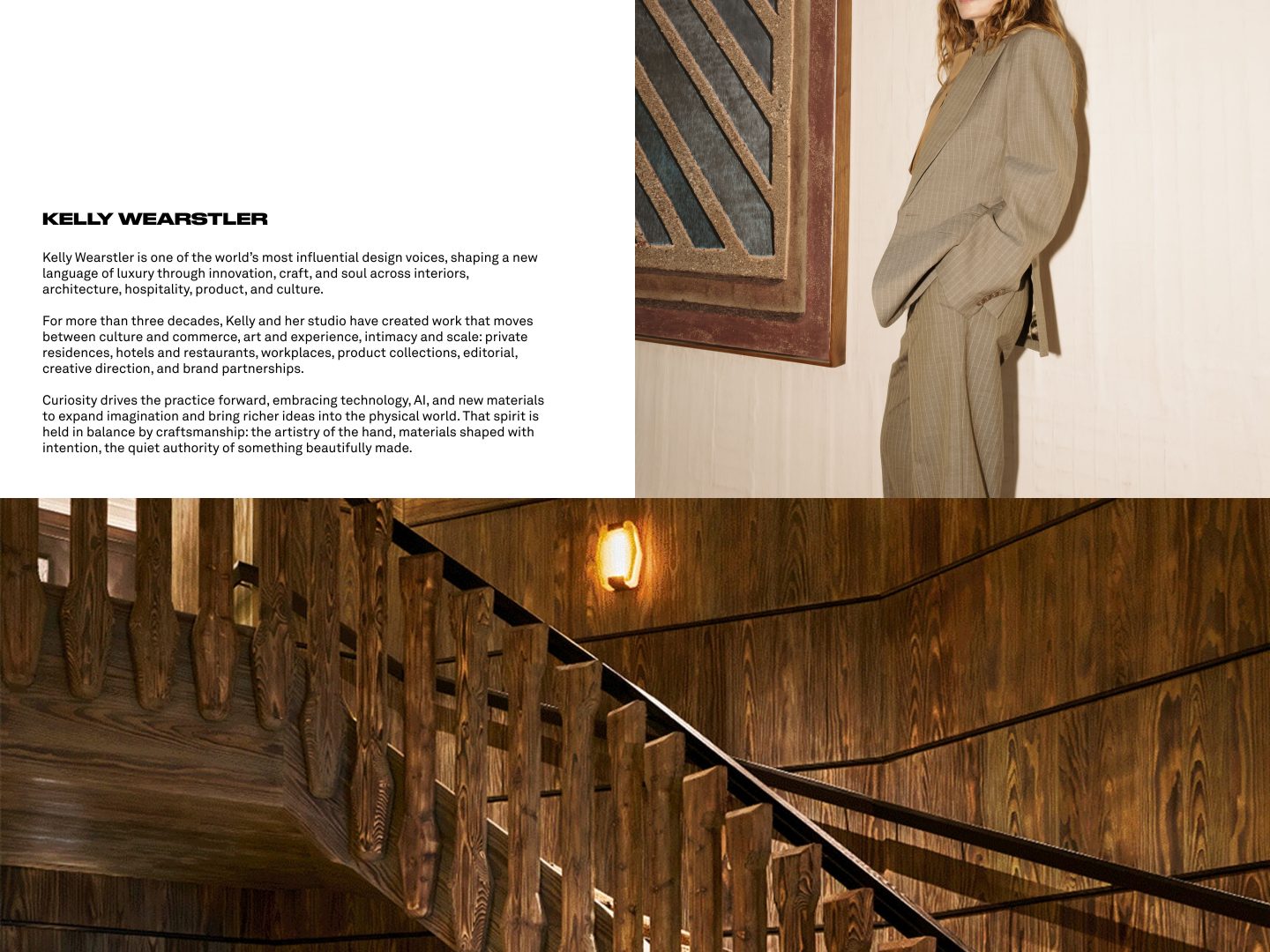
The Auteur. Wearstler's bio reads the way museum wall text reads: third person, unhurried, certain. Hotels, monographs, product lines and decades of work are arranged not as a résumé but as evidence of one singular sensibility. Nowhere does the page ask for the job, which is precisely why it gets it. Steal this: arrange your credentials as proof of a worldview rather than a list of things you have done. If the work has real weight behind it, write like the institution, not the applicant.
Common bio mistakes
Opening with a resume of every city you have lived in before the reader knows what you design. Listing software skills as if the client hires AutoCAD. Using stock phrases about "transforming spaces" with no project proof nearby. Hiding the call to action below three screens of press logos. Fix those first; polish second.
Length and structure that work
Most strong About pages lead with a short positioning paragraph (who you serve, where, in what kind of work), follow with origin and point of view, show two or three proof points (press, awards, signature projects), introduce the team if relevant, and end with a clear invitation. Total length often lands between 300 and 700 words of visible prose, not counting captions. Enough to feel considered. Short enough to finish on a phone.
Photography on the About page
A composed portrait helps when the principal is part of the offer. A studio or process image can replace it when the brand is more collective. Avoid cropped party photos and heavy filters. Match the color grade to the portfolio so the About page feels like the same house as the project pages.
Updating without constant rewrites
Refresh when the work shifts (new city, new sector, new fee floor) or when press and awards pile up enough to change the proof section. Otherwise, leave a strong page alone. Constant tinkering usually dilutes a clear sentence into a safer one.
2. Ken Fulk: kenfulk.com
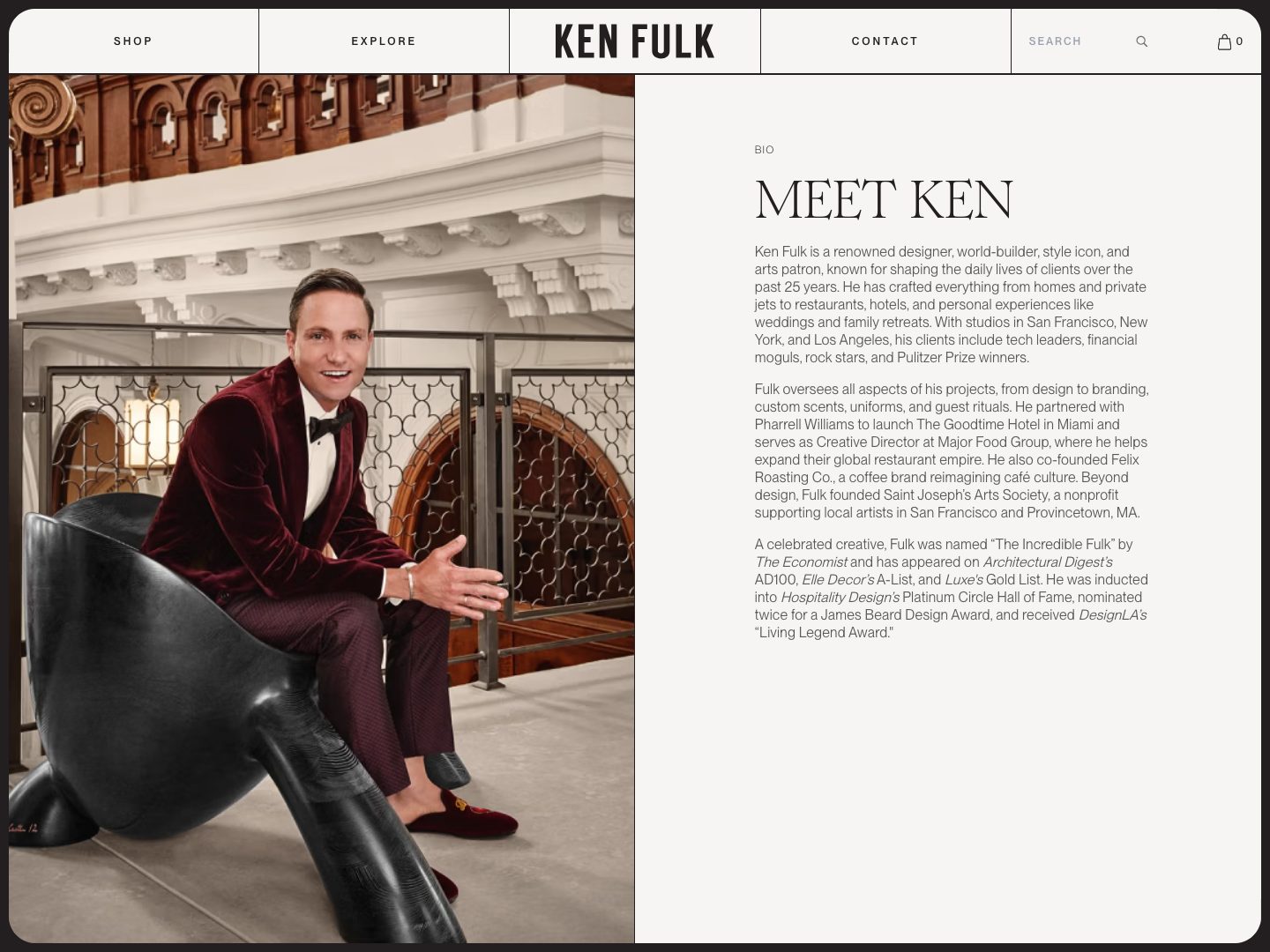
The Storyteller. Fulk builds worlds, a former Provincetown church here, a San Francisco clubhouse there, and his About page performs the same trick in prose. It reads like the opening of a novel, full of place and character, because narrative is the product his clients are buying. Steal this: if working with you is an experience, the page should stage that experience, not describe it from a distance.
3. Brigette Romanek: romanekdesignstudio.com
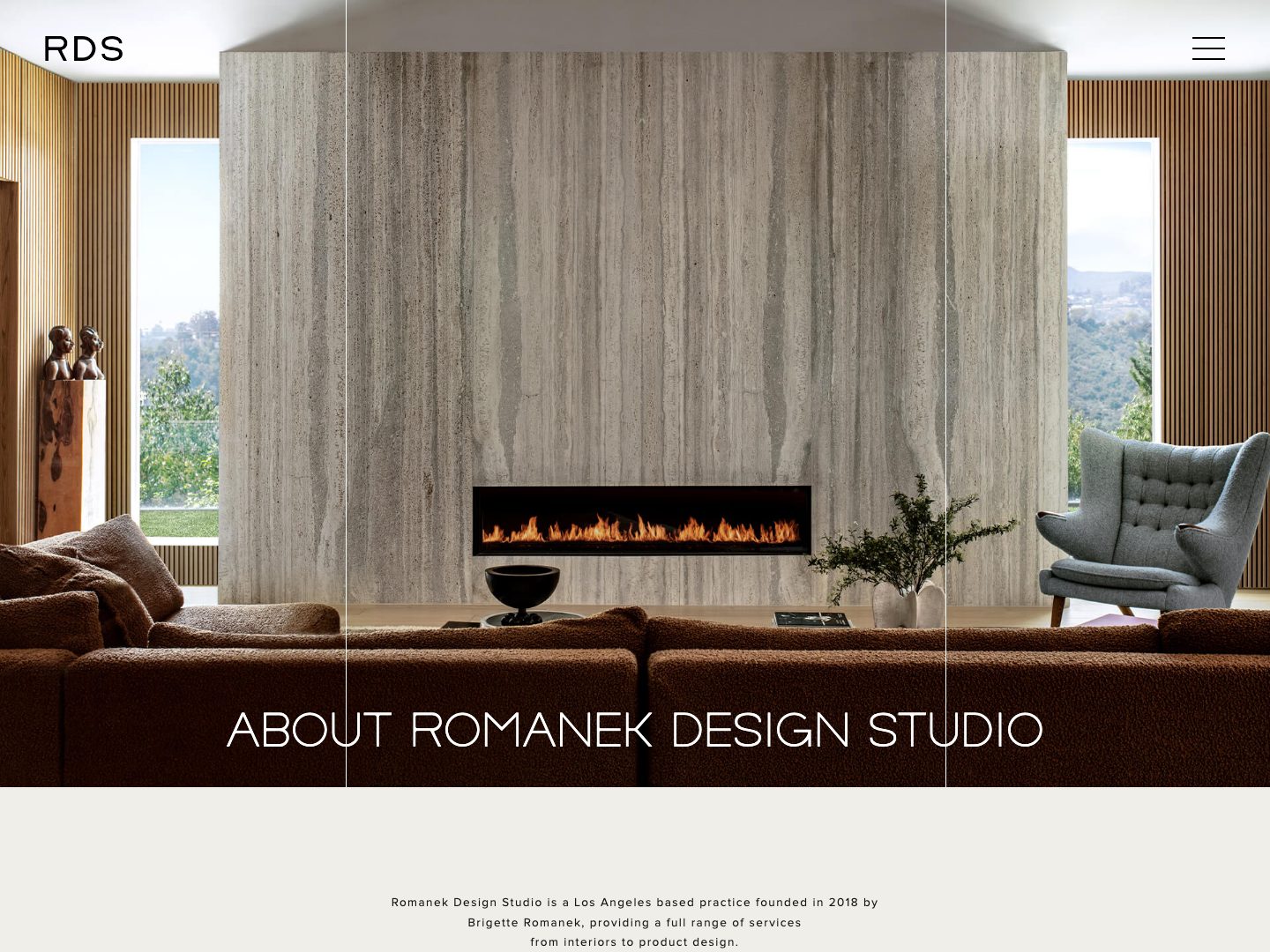
The Second Act. Romanek came to design from the music business, self-taught, and her bio leads with that rather than apologizing for it. The unconventional path becomes the origin of a point of view she has compressed into two words, livable luxe, that editors and clients now repeat for her. Steal this: a nonlinear career is an asset once you frame it as the source of your eye. Then coin the phrase for what only you do, two words, and use it everywhere.
4. Beata Heuman: beataheuman.com
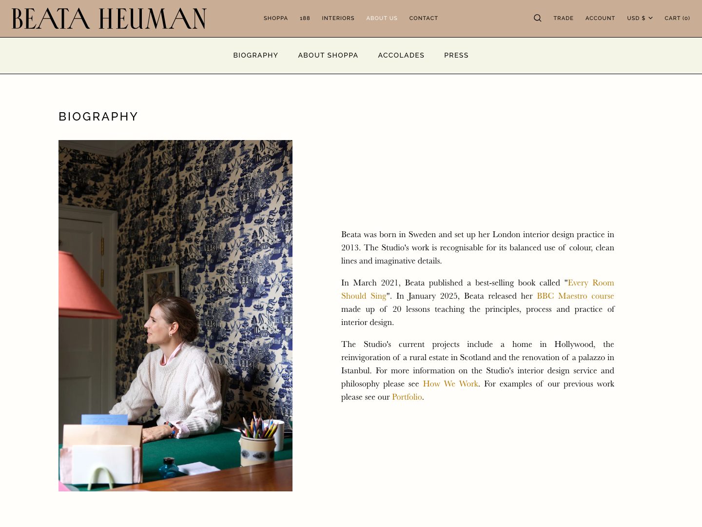
The Character. A childhood in rural Sweden, formative years under Nicky Haslam, rooms with actual wit in them: Heuman's biography explains her aesthetic so well that by the end the whimsy feels inevitable. Taste, her page argues, has a provenance. Steal this: one vivid origin detail does more work than ten adjectives. Tell the reader where the sensibility was formed and the style needs no defending.
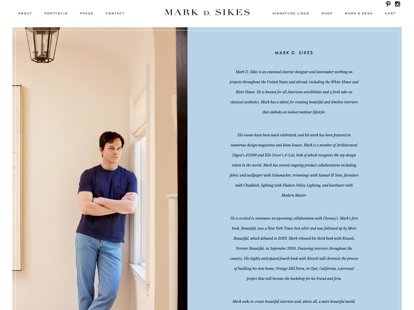
5. Mark D. Sikes: markdsikes.com
The Sunny Classicist. Blue and white, garden stripes, American classicism worn without irony, and prose with the same warmth as the rooms. The books are there, the press is there, but what closes is the feeling that the person and the work are the same temperature. Steal this: match the voice to the rooms. If you design warmth, write warm. A cold, corporate bio above joyful work reads as a contradiction, and contradictions cost trust.
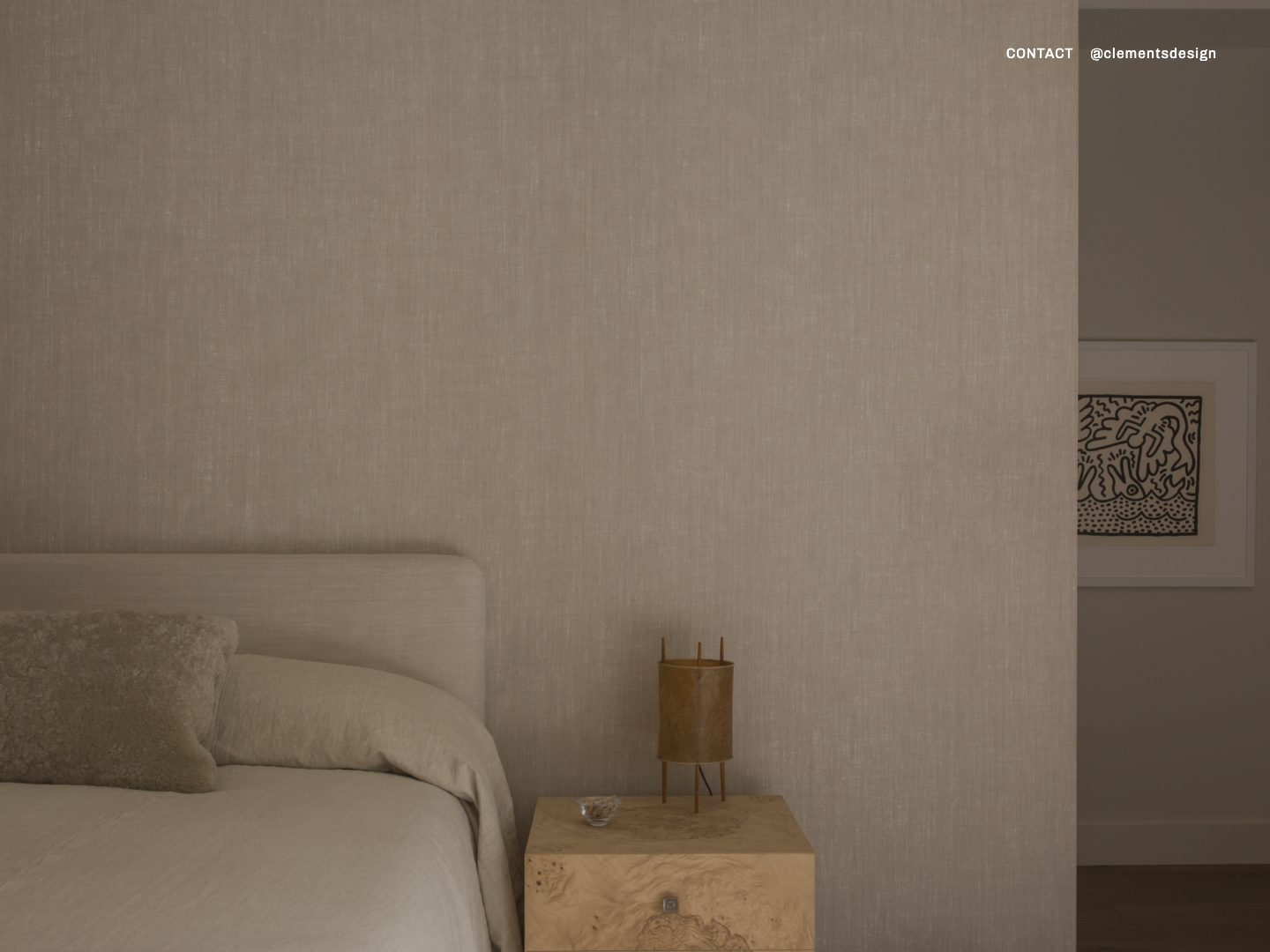
6. Clements Design: clementsdesign.com
The Quiet Flex. Kathleen and Tommy Clements run one of the most in-demand studios in Los Angeles, and their entire website is a full-screen photograph with a contact link in the corner. No biography, no client list. The names arrive anyway; when Architectural Digest toured Kendall Jenner's house in 2020, the credit read Clements Design, alongside Waldo's Designs. Steal this: an empty page is a flex only when the press has already written your bio for you. Count the coverage that carries your name before you cut, and if the count is low, keep the paragraph.
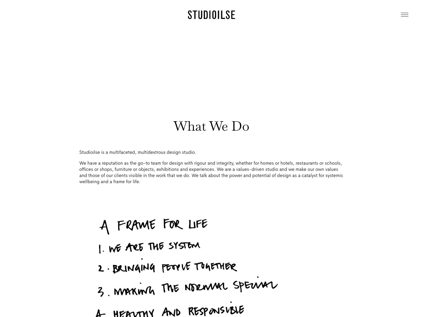
7. Studioilse, Ilse Crawford: studioilse.com
The Philosopher. Crawford has spent a career insisting that design serves human wellbeing, a frame for life rather than a look, and her studio's About page holds that line before it shows a single credential. Readers who nod inquire; readers who want spectacle look elsewhere, and both outcomes serve the studio. Steal this: state what you believe about homes plainly. A conviction filters your inquiries better than any budget field on a form.
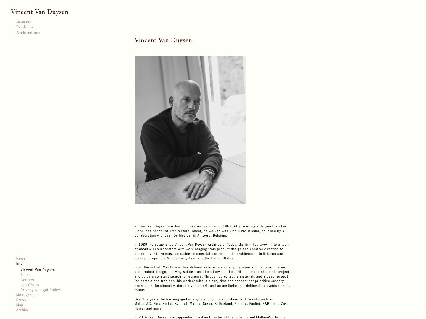
8. Vincent Van Duysen: vincentvanduysen.com
The Essentialist. The Antwerp master of serene, material-honest interiors writes, fittingly, with almost no adjectives. Permanence, silence and craft come through in sentence rhythm as much as in claims. The page feels like standing in one of his rooms. Steal this: the prose should feel like the space. If you design calm, do not write loud, and if you design exuberance, do not write like a notary.
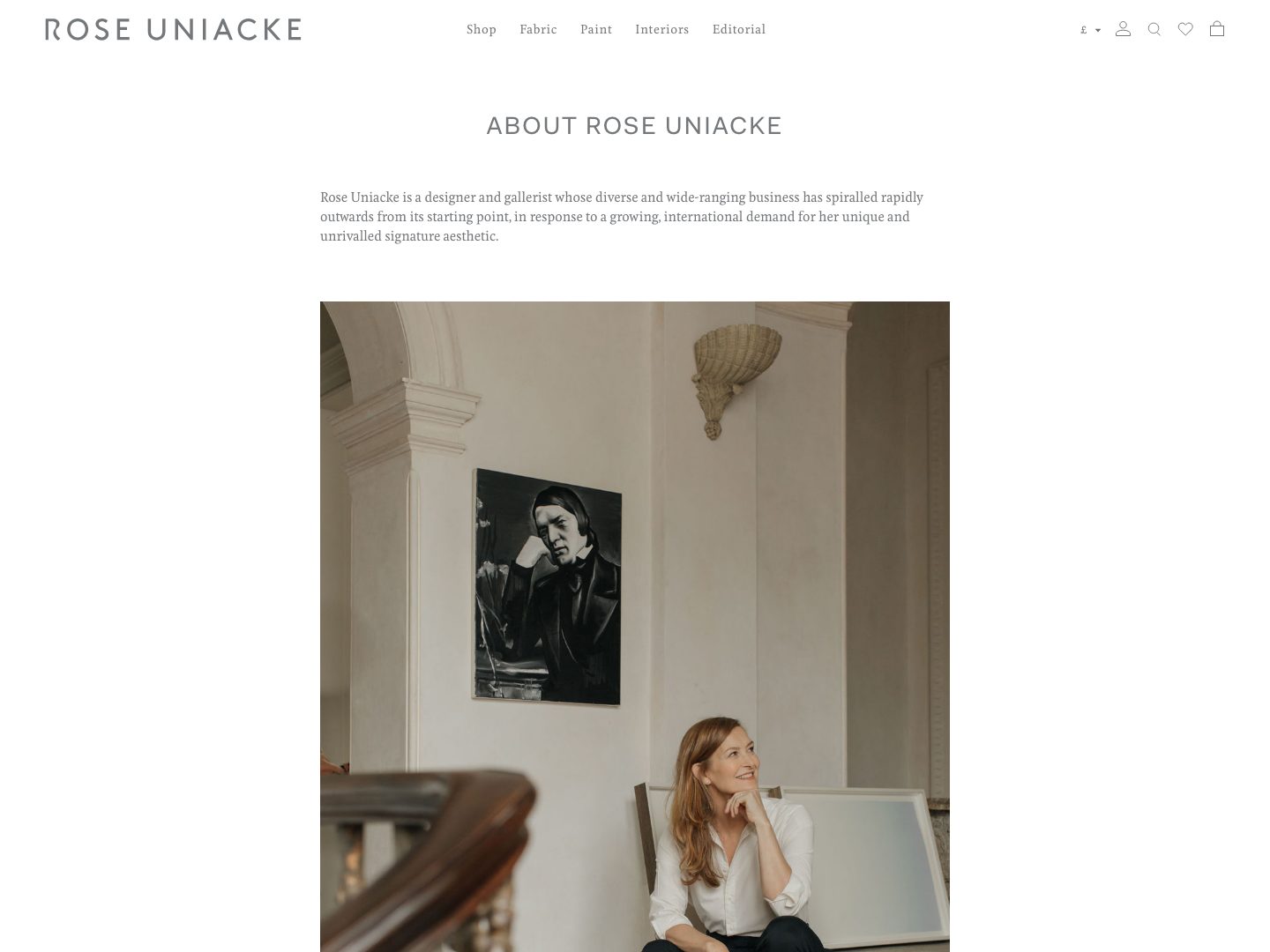
9. Rose Uniacke: roseuniacke.com
The Atelier. Uniacke began in antiques and restoration, and the About presence keeps that quiet authority: understated language, deep specificity about materials and provenance, nothing raised above a murmur. Restraint, on her pages, is the luxury signal. Steal this: what you leave out is a statement. Let one perfect fact sit in silence rather than crowding it with three average ones.
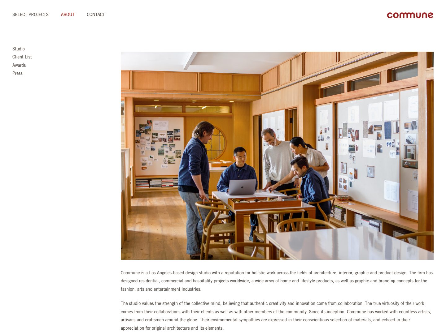
10. Commune Design: communedesign.com
The Collective. Commune's story is a way of working, collaboration across disciplines in the California tradition, rather than a single face. The About page gives the philosophy the starring role, with the partners in service of it. Steal this: if your studio is genuinely plural, do not force a founder-portrait format. Give the reader one shared story and let the team stand inside it.
What the ten have in common
Read side by side, the pages differ in voice and agree on principle. They are written for the client, never for other designers, so there is no trade jargon to decode. Their origins are specific, a farm in Sweden, a record label, an antiques stall, because specificity is believability. Each carries one phrase a client could repeat at a dinner party. Proof is curated rather than dumped: three heavy facts beat twenty light ones. The photograph agrees with the words. And every page ends somewhere, with a door the reader can walk through.
How to write yours: a structure that holds
You can write a bio that stands with the ten above in an afternoon. Work through seven parts in order, then read the result aloud and cut a third.
1. Position in one line. Who you serve and what they get. Not a mission statement, a sentence a stranger could repeat accurately after one reading.
2. The origin of your eye. Where the taste comes from: a place, a training, a first obsession. This is the part readers remember, and the part most bios skip.
3. What you believe. One conviction about homes, stated plainly. It will repel a few readers. That is the point.
4. What working with you feels like. Two or three sentences on the experience, calm, exacting, collaborative, whatever is true, without a process diagram.
5. Proof, curated to three. the strongest press mention, the most telling project, the credential that matters in your market. Everything else goes to a press page.
6. One human detail. Chosen deliberately, not confessed: the garden, the ceramics habit, the city you cannot stop returning to. One is charming. Four is a dating profile.
7. The invitation. Tell the reader what happens next and give them the link. A bio that ends without a next step is a shop with no door.
First person or third person?
Decide by how clients meet you. If they arrive from Instagram, where the brand is your face and your voice, first person keeps the promise the feed made. If they arrive through referrals, press or a project credit, and the studio is positioned above any one founder, third person carries more authority. Choose one and hold it for the whole page; switching mid-bio is the written equivalent of a handshake that changes grip. If you are unsure, reread the last three emails clients actually answered warmly, and write in that register.
A worked example
Here is the kind of paragraph that opens thousands of studio About pages:
"Elena Marsh Interiors is a full-service interior design studio offering turnkey solutions for residential and commercial clients. With a passion for design and an eye for detail, we create beautiful, functional spaces tailored to each client's unique needs and lifestyle."
Forty words, and any studio in America could sign them. Nothing disqualifies the reader, so nothing persuades her either. The same designer, rewritten with the structure above:
"Elena Marsh spent nine years restoring Georgian townhouses in Dublin before she ever hung wallpaper in Dallas, and the practice still shows: architecture first, decoration second. Her studio takes on eight whole-home projects a year for families who want rooms that hold up to real life, dogs, dinner parties and all. Clients describe the process the way her joiners do, exacting, calm, finished when it is right rather than when it is fast. Her work has appeared in House Beautiful, and more than once a project has persuaded a client to keep a house they had meant to sell. If that sounds like your kind of designer, the studio is taking inquiries for projects beginning this autumn."
Same designer, same facts available. What changed is provenance, a number that signals selectivity, a texture of process, one piece of proof with a story in it, and an ending with a door. Note what is absent: the word passion, the word unique, and any claim the reader has seen a thousand times.
Mistakes that quietly cost inquiries
The résumé dump. Twelve credentials in a row read as insecurity. The humble mumble. Openers like "we are a small studio, but" teach the reader to discount you. "A passion for design." The phrase appears on ten thousand About pages; it persuades no one and it is always cuttable. Writing for peers. Editors and other designers are not hiring you; the client is, and she does not know what FF&E means. No photograph, or the wrong one. A warm first-person bio beside a stiff corporate portrait cancels itself out. Ending in air. No link, no invitation, no next step. Burying the page. If About lives only in the footer, you have hidden the room where clients decide.
Your Instagram bio is the short version
The same positioning, compressed to 150 characters: what you do, for whom, where, one piece of proof, and a note about where the link leads. A workable shape: "Whole-home interior design for families and collectors · Los Angeles · As seen in House Beautiful · New projects for spring below." Write the About page first and the Instagram bio falls out of it. Our guide to Instagram marketing for interior designers covers the rest of the profile.
Where the About page fits
An About page converts attention that other channels create; it does not create attention on its own. The site around it has to hold up, which is covered in our guide to the 12 essential website features for interior designers, and the system that brings readers to it is laid out in 20 proven strategies to get more interior design clients and how to get high-end interior design clients. One more reason to get the page right: AI assistants now read About pages when someone asks them to recommend a designer, and the clearer your positioning, the more quotable you become.
And if you would rather have this written, tested and wired into a site that converts, that is the job of our interior design marketing agency. Tell us about your studio.
Frequently asked questions
Seven things, in roughly this order: a one-line statement of who you serve and what they get, the origin of your eye, what you believe about homes, what working with you feels like, up to three pieces of proof such as press or notable projects, one deliberate personal detail, and a clear invitation to inquire. Most strong bios run 300 to 600 words.
Long enough to build trust and short enough to be read in one sitting: 300 to 600 words for the main bio is the range the strongest studios use. Teams can add a two-or-three-sentence bio per principal below the studio story rather than stretching the main text.
Decide by how clients meet you. If the brand is you, your face and your voice, write in first person; it is warmer and matches what your Instagram followers expect. If you are building a studio positioned above any one founder, write in third person; it carries more institutional authority. Choose one and never mix the two on the same page.
One hundred and fifty characters that answer four questions: what you do, for whom, where, and why you can be trusted. A workable pattern is specialty plus client, city, one piece of proof, and a note about where the profile link leads. Skip the emoji clutter and the word passionate.
Yes. The About page is consistently among the most visited pages on a design studio's site, and it is read at the exact moment a prospective client decides whether to make contact. It is also what AI assistants quote when someone asks them to recommend a designer, which makes clear positioning on that page more valuable now than it has ever been.