
Website Design for Artists: Qué hacemos Wins Representation and Sales
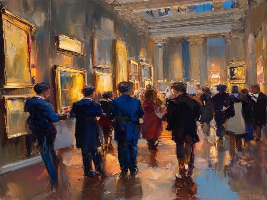
When a curator, gallery, or collector hears your name, the first thing many of them do is search for it. Qué hacemos they find, or fail to find, shapes their impression before they ever see your work in person. A strong website is the first studio visit they take. It should present your work clearly, tell them who you are, and make it easy to reach you. This guide covers what an artist site needs, whether your goal is representation, sales, or both.
Decide what the site is for
Before choosing a single design element, be honest about the goal. An artist seeking gallery representation needs a site that reads as serious and professional to curators and dealers. An artist selling directly needs clear paths to purchase or inquire. An artist doing both needs to balance the two without looking like a store. The goal shapes every later decision, so name it first.
Lead with the work
The work is the reason anyone is on your site, so it should dominate. Use large, accurate, high-quality images, and resist the urge to decorate around them. A clean, restrained design signals confidence and lets the art speak. Cluttered layouts, heavy animation, and loud color schemes distract from the one thing a visitor came to see. When in doubt, remove rather than add.
The pages an artist site needs
Most artist sites need only a few pages, done well. A portfolio or works section, ideally organized by series or body of work, is the heart of the site. An about or statement page tells your story and gives context. A page listing exhibitions, press, and collections builds credibility, which matters enormously to curators and dealers. And a clear contact page makes reaching you effortless. Resist adding pages that dilute rather than strengthen this core.
Write a statement people finish reading
Your artist statement and biography do real work, both for human visitors and for search engines and AI tools trying to understand who you are. Write plainly. State what you make, what it explores, and the facts of your training, exhibitions, and recognition. Skip the dense art-speak that so many statements hide behind. A clear, confident statement builds more trust than a paragraph nobody can parse.
Get found when someone searches your name
The most valuable search for an artist is your own name, and you should own the top result for it. Make sure your name appears in your page titles, your statement reads clearly, and your images carry descriptive alt text. Link your site from your gallery pages, social profiles, and any press. This is the artist version of SEO for galleries, and it increasingly determines whether AI assistants describe you accurately when someone asks. See how that works in getting recommended by AI search.
Make contact effortless
Curators and collectors are busy, and a hard-to-reach artist loses opportunities. Put a clear, simple way to make contact on every page. If you sell directly, make inquiring about a work obvious beside the work itself. Confirm inquiries quickly, because a slow or missing response tells a professional you may be hard to work with. The principles here mirror our guide to art gallery website design, adapted to a single artist.
Cómo Nakada Design helps
We design and build websites for artists and for the galleries that represent them, engineered to present work beautifully and to be found by the right people. If you want a site that wins attention from curators and collectors, tell us about your practice.
Qué hacemos high-caliber clients notice first
When art galleries evaluate a studio or firm, they rarely start with a campaign metric. They start with whether the practice feels steady: clear process, consistent proof, and communication that respects their time. That standard should guide every section of this subject, including how you apply the ideas on this page to art galleries.
Concrete signals matter more than claims. Nombred phases, named owners, visible response times, and work that matches the commissions you want next will always outperform generic promises. If a recommendation on this page cannot be scheduled, measured, or put in a proposal, rewrite it until it can.
Website structure that converts quiet interest
A strong practice site does three jobs: prove taste, explain process, and make the next step obvious. Lead with the strongest recent work. Follow with how engagement works. End with a single primary inquiry path. Secondary links for press, careers, and tools can exist, but they should not compete with the contact action on the same screen.
Speed, mobile layout, and image quality are the first proof of care. Compress galleries without dulling material detail. Test the form on a phone. State response expectations after submit so serious clients know what happens next.
Un plan de implementación de noventa días
Days 1, 30: audit what you already have. List the pages, profiles, and tools that touch clients. Remove contradictions in naming, services, and contact paths. Choose three priorities only.
Days 31, 60: ship proof. Update the highest-value project pages or listings, fix the inquiry form, and put a simple tracking note on every new lead source. Begin the weekly cadence described above and keep it even when a project peaks.
Days 61, 90: review numbers and language. Keep what produced fit conversations. Pause what produced noise. Rewrite one weak page rather than launching five new ones. Steady improvement compounds more reliably than occasional bursts.
Cómo this connects to the rest of the practice
Marketing, search, and operations only work when they describe the same studio. Proposal language, website process copy, and social proof should agree. When they diverge, sophisticated clients notice.
If you want a partner to align these pieces for art galleries, start with a focused conversation through consultar. Para utilidades prácticas del estudio, vea nuestras herramientas gratuitas.
Decisiones antes de invertir más
Be explicit about the commissions you want in the next twelve months. Be explicit about the geography and fee band. Be explicit about who owns follow-up when the principal is on site. Those three decisions determine which tactics on this page deserve budget.
Write them down. Share them with anyone who answers the phone or the inbox. Then revisit this article's recommendations and keep only the ones that serve that written target. That is how a boutique practice stays selective without becoming static.
Finally, protect time for craft. Every system here exists to return hours to design, building, collecting, or brokerage work. If a tactic consumes more attention than it returns in qualified conversations, it is a distraction dressed as progress.
Preguntas frecuentes
A portfolio organized by series or body of work, an about or statement page, a page of exhibitions and press for credibility, and a clear contact path. Most artist sites need only a few pages done well, with the work itself leading throughout.
By owning the top result for their own name. Put your name in page titles, write a clear statement, add descriptive alt text to images, and link your site from gallery pages, social profiles, and press. This also helps AI assistants describe you accurately.
Decide the primary goal first, because it shapes the design. A site aimed at representation should read as serious to curators and dealers; a site aimed at sales needs clear paths to inquire or buy. A site doing both must balance them without looking like a store.