
25 Best Art Gallery Websites in 2026
A gallery website is where most collector relationships now begin. Before a first visit, before an art fair, before an inquiry, a buyer looks you up, and the site either earns the next click or loses it. The galleries below run some of the strongest websites in the field going into 2026. They reach across New York, London, Paris, Los Angeles, Zurich, Mexico City and beyond, from global mega-galleries to focused programs with a sharp point of view. We chose them for how well each site presents the work, how easy it is to browse artists and exhibitions, how fast the pages load, and how naturally the site turns interest into contact. Use the list as a reference for your own site, and read our companion piece on what makes the strongest gallery websites work for the design principles underneath it. We later measured every gallery on this list, along with 90 other leading luxury websites, in The Luxury Web Index 2026, scoring how visible each is to Google and AI assistants.
Cómo we chose these gallery websites
We looked past surface polish for the choices that actually help a gallery place work:
- Trabajos first. Restraint and generous space that let the art lead rather than the interface.
- Real artist pages. Substantial biographies, well-edited selections of work, exhibition history and press.
- A viewing room or its equivalent. A focused way to present available work with a clear path to inquire.
- Speed with high-resolution images. Crisp detail that still loads quickly on a phone.
- An obvious next step. An inquiry path placed where interest peaks, asking for little.
The 25 best art gallery websites in 2026
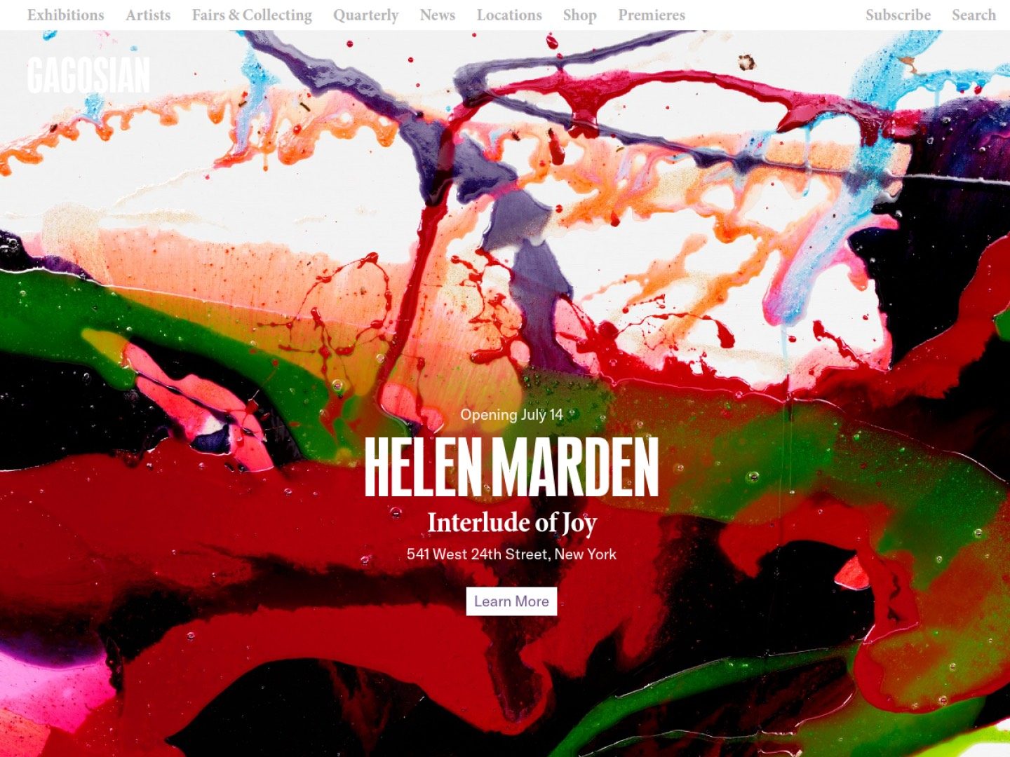
1. Gagosian: gagosian.com
Gagosian runs one of the largest gallery networks in the world, with spaces across New York, Los Angeles, London, Paris, Rome, Athens and Hong Kong. The website carries that scale without feeling heavy. A clean grid of exhibitions and artists, strong installation photography, and the online edition of Gagosian Quarterly give the site genuine editorial pull. Artist pages are thorough, and the whole thing stays quick to move through.
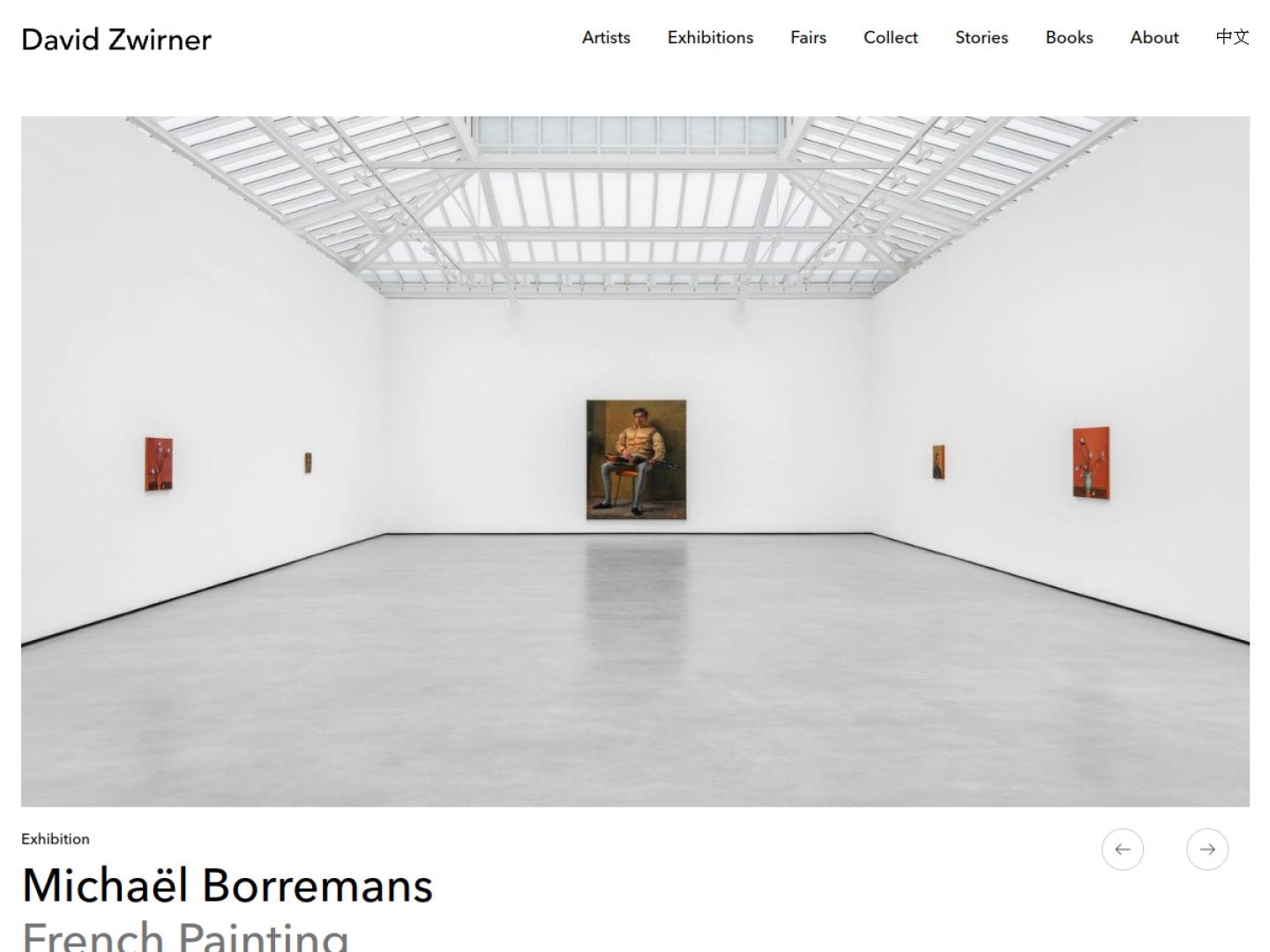
2. David Zwirner: davidzwirner.com
Zwirner helped define what a gallery website can do. The gallery was an early force behind the online viewing room, and that feature remains a permanent, well-built part of the site rather than a leftover experiment. The artist pages run deep, exhibition histories are complete, and the podcast and editorial content give collectors reasons to return between shows.
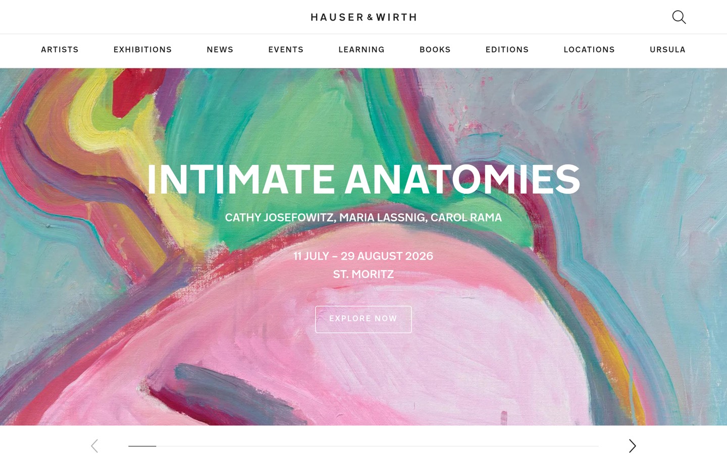
3. Hauser & Wirth: hauserwirth.com
Hauser & Wirth treats its website as an extension of a program that now includes galleries, restaurants and the art destination on Menorca. The site balances a large roster with calm navigation, and its magazine, Ursula, adds depth that pure inventory pages cannot. Exhibition pages come with installation views and real reading material.
4. Pace: pacegallery.com
Founded in 1960, Pace pairs a long history with an unusually forward digital program. The site presents artists and exhibitions cleanly, and the gallery has been among the more willing to experiment with technology, from viewing rooms to work at the meeting point of art and computation. Pages are image-led and easy to scan.
5. White Cube: whitecube.com
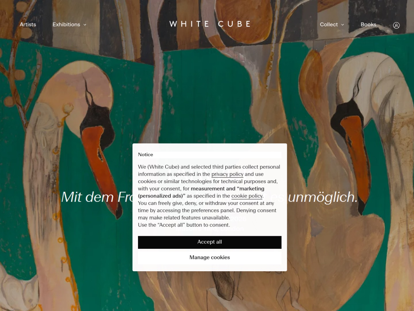
White Cube's site matches the restraint the gallery is named for. A spare palette and confident typography keep attention on the work, while the viewing rooms and exhibition pages are cleanly built and quick to load. Artist pages are substantial, with a clear route to inquire on available work.
6. Perrotin: perrotin.com
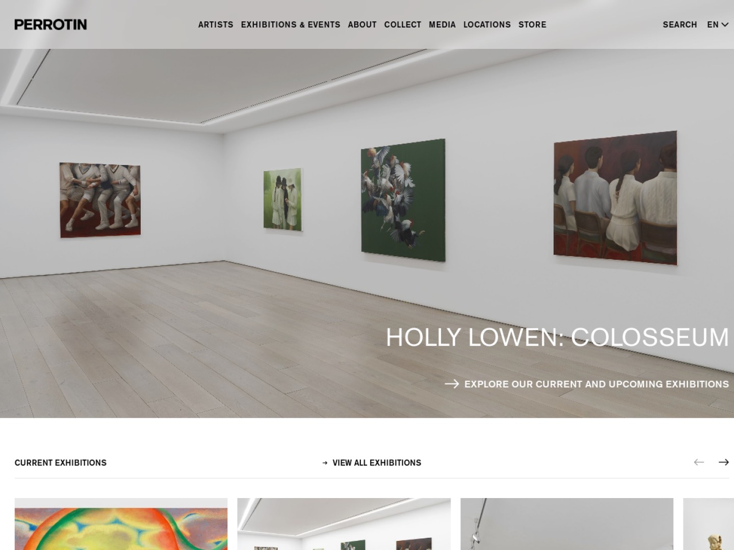
Perrotin runs a wide international program, and the website handles a busy roster with a bright, orderly interface. Exhibition and artist pages are generous with imagery, the editions and store section is well integrated, and the site keeps its energy without becoming cluttered.
7. Lisson Gallery: lissongallery.com
One of the longest-running galleries of its kind, Lisson keeps its site measured and content-rich. Exhibition pages read almost like short essays, artist archives run deep, and the design stays out of the way of the work. It is a strong example of authority built through thorough, well-organized content.
8. Thaddaeus Ropac: ropac.net
With spaces in London, Paris, Salzburg and Seoul, Ropac uses its website to carry a scholarly, exhibition-heavy program. Pages are dense with installation views, texts and press, yet navigation stays clear. The site rewards a collector who wants to read and look in equal measure.
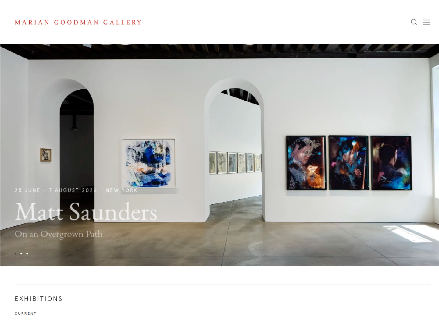
9. Marian Goodman Gallery: mariangoodman.com
Marian Goodman's site reflects a program known for rigor. The design is quiet and typographic, exhibition documentation is careful, and artist pages are built for people who want substance over spectacle. It loads fast and reads cleanly on any screen.
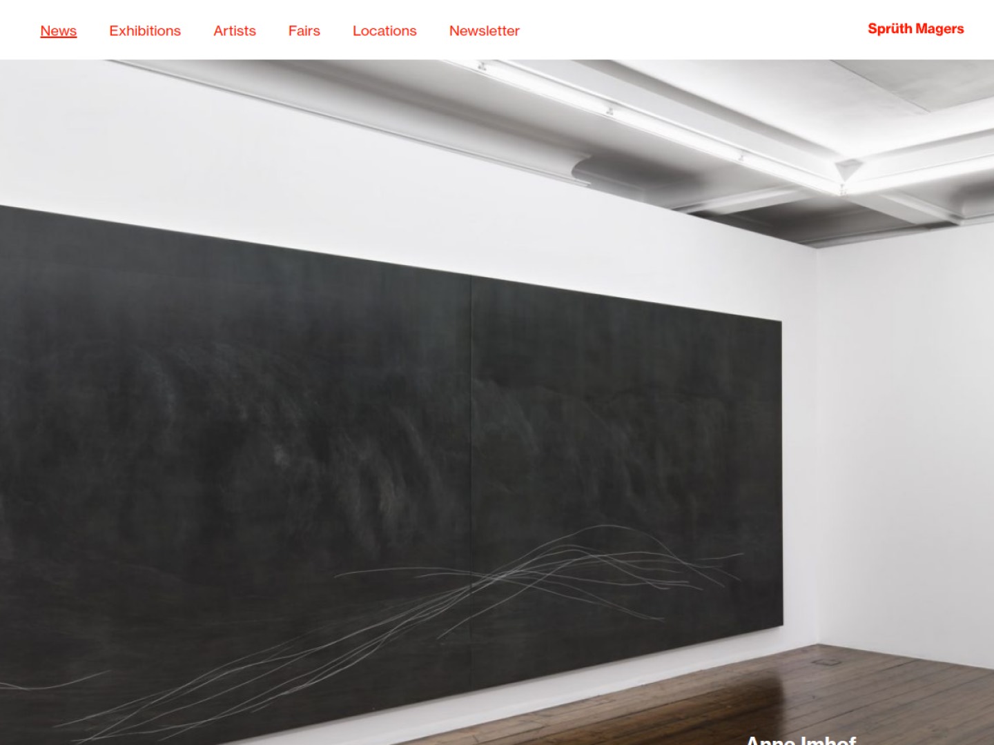
10. Sprüth Magers: spruethmagers.com
Sprüth Magers keeps a cool, gridded interface that suits its conceptual and media-driven roster. Exhibition pages are well photographed, artist archives are thorough, and the structure makes a large program easy to move through.
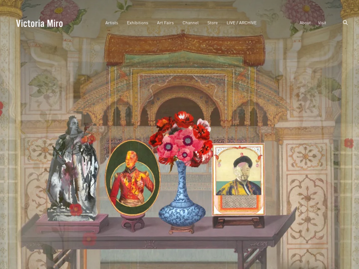
11. Victoria Miro: victoria-miro.com
Victoria Miro has long treated its website as a serious sales and viewing channel, with well-developed online viewing rooms and detailed artist pages. Strong photography and a clear inquiry path make it easy to move from looking to contact.
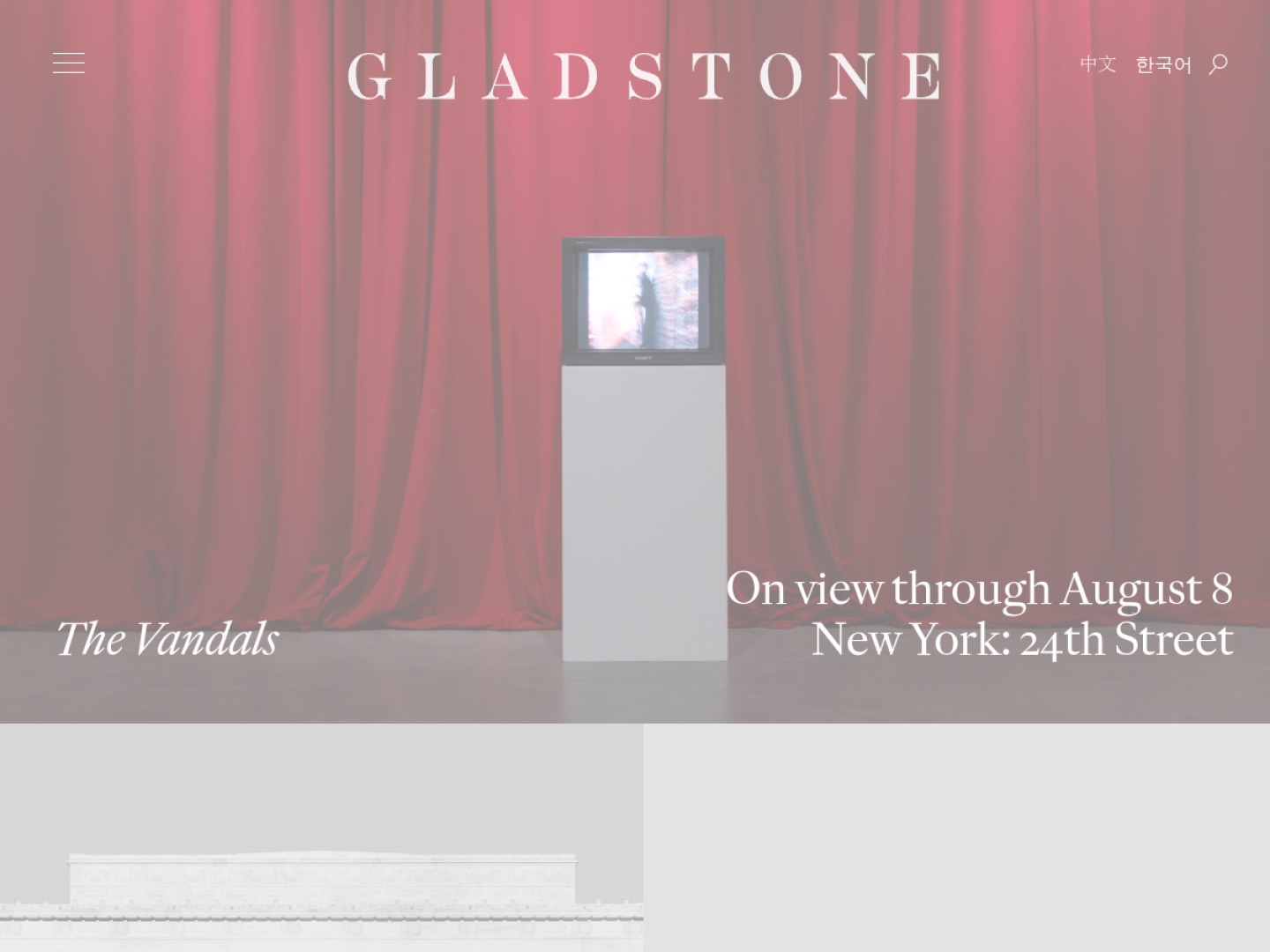
12. Gladstone Gallery: gladstonegallery.com
Gladstone's site is spare and image-forward, giving its artists room without distraction. Exhibition pages are cleanly documented, and the navigation stays simple even as the program spans New York, Brussels, Rome and Seoul.
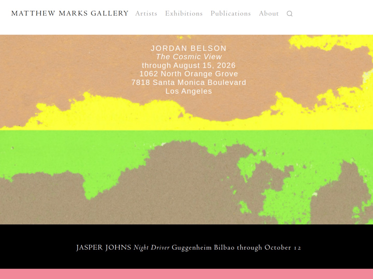
13. Matthew Marks Gallery: matthewmarks.com
Matthew Marks runs one of the most pared-back sites on this list, and it works. The restraint reflects the gallery's focus, letting a small number of exhibitions and artists carry the page with excellent photography and a minimal interface.
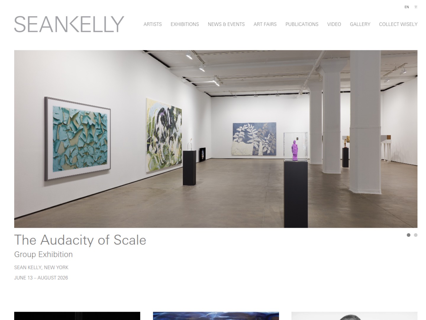
14. Sean Kelly: skny.com
Sean Kelly's website is warm and well-structured, with substantial artist pages, clear exhibition documentation, and a steady stream of news that keeps the site current. It is a good model for a gallery that wants depth without heaviness.
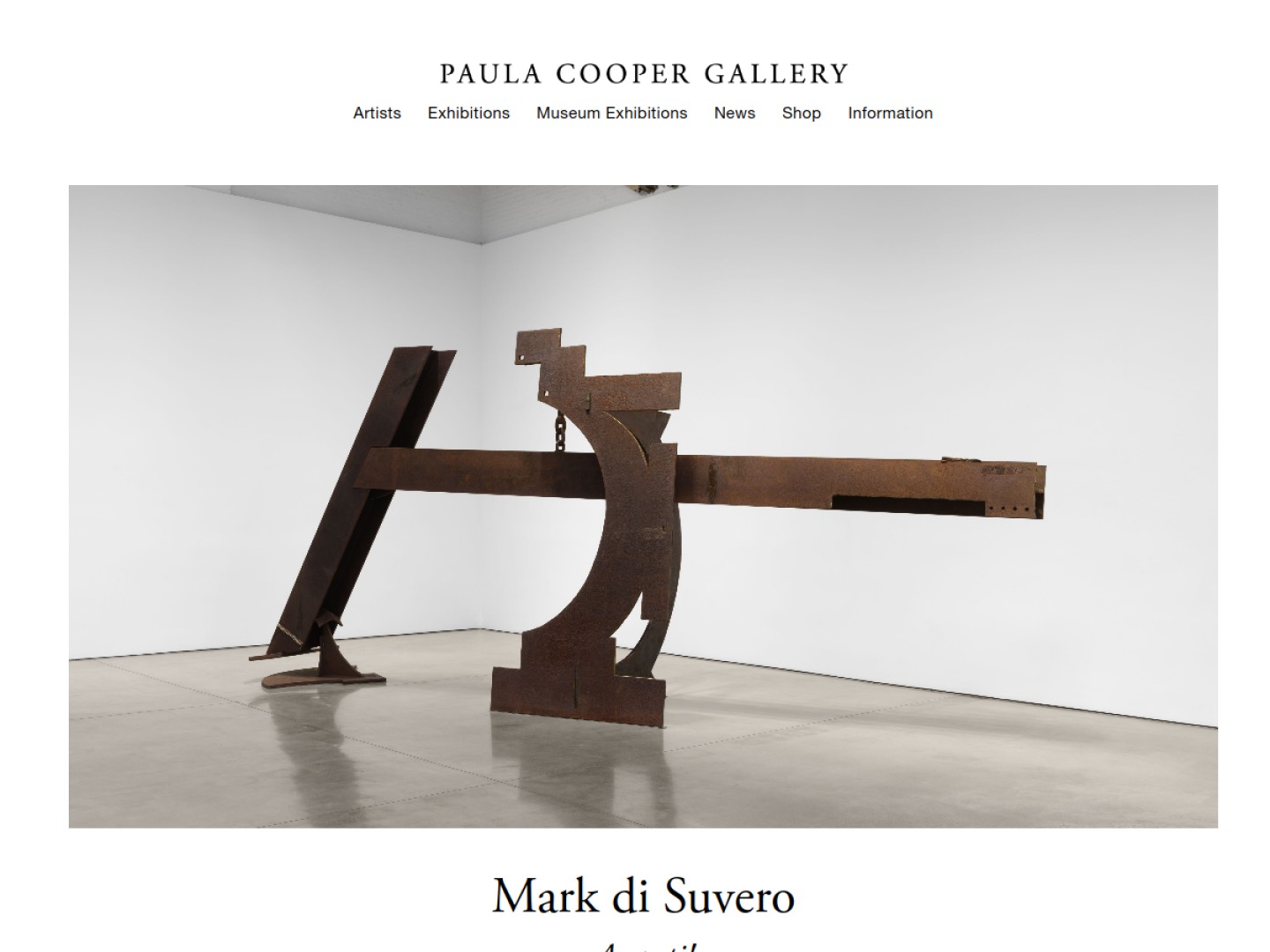
15. Paula Cooper Gallery: paulacoopergallery.com
A pioneer of the SoHo gallery scene, Paula Cooper keeps a clean, classic site that foregrounds the work. Exhibition and artist pages are carefully documented, and the quiet confidence of the design suits the gallery's history.
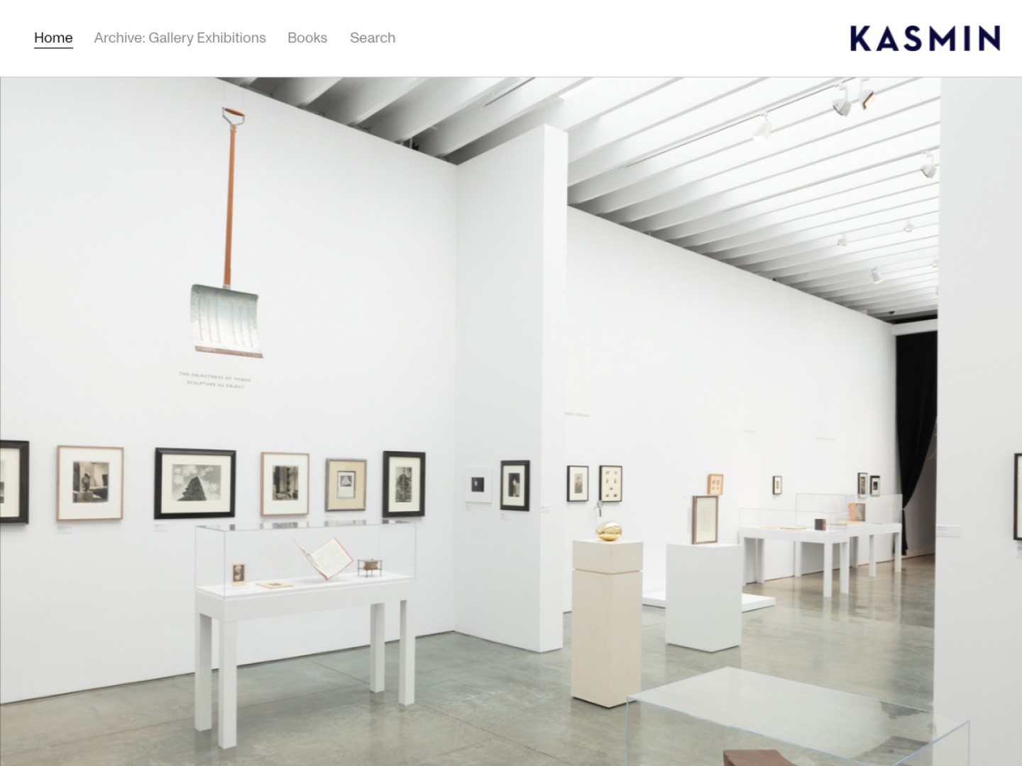
16. Kasmin: kasmingallery.com
Kasmin's site is bright and easy to browse, with strong installation photography and a well-organized roster. Its rooftop and offsite projects get real space online, giving the impression of a program that lives beyond its walls.
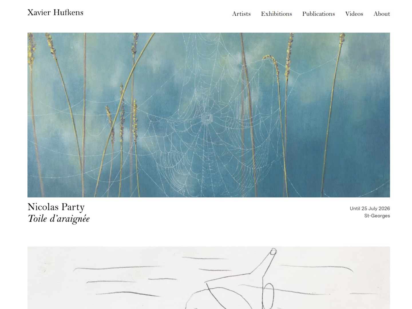
17. Xavier Hufkens: xavierhufkens.com
The Brussels gallery runs a calm, well-built site with generous imagery and thorough artist pages. Navigation is simple, pages are quick, and the documentation is detailed enough to satisfy a serious collector.
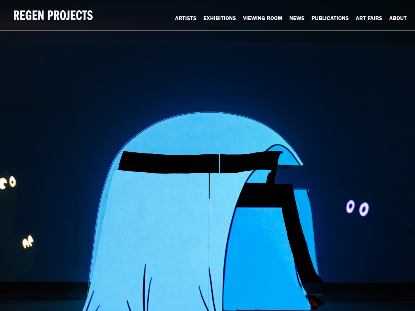
18. Regen Projects: regenprojects.com
A cornerstone of the Los Angeles scene, Regen Projects keeps a clean, photography-led site that documents its exhibitions with care. Artist pages are substantial, and the design stays understated in a way that matches the gallery's reputation.
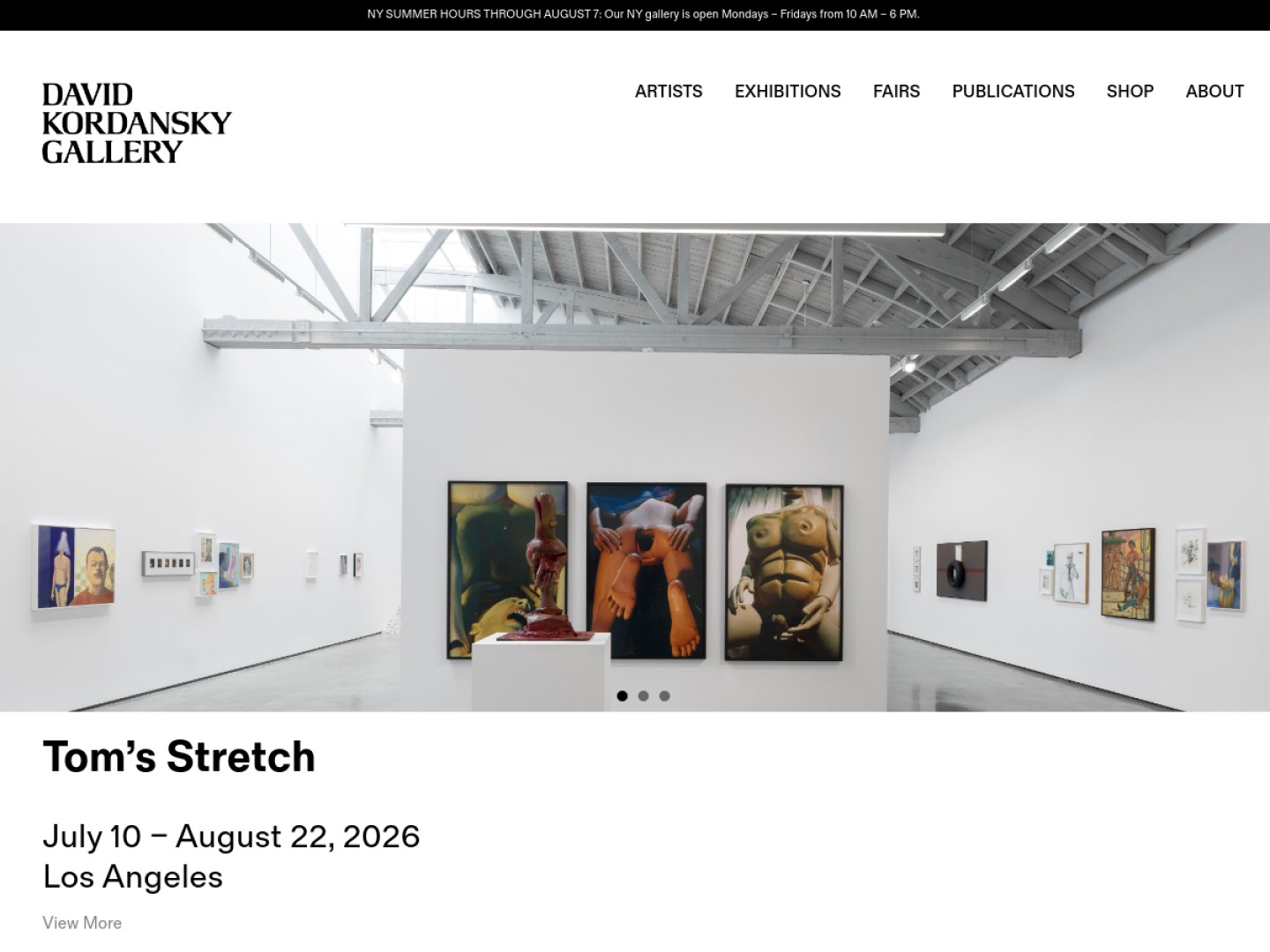
19. David Kordansky Gallery: davidkordanskygallery.com
Kordansky's site pairs bold, full-width imagery with confident typography and a restrained palette. It is a strong example of a gallery site that feels contemporary and editorial while keeping the work firmly in the lead.
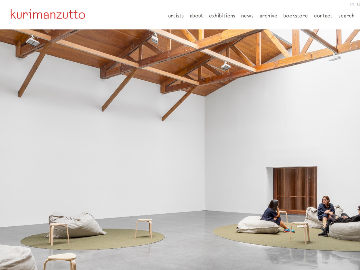
20. Kurimanzutto: kurimanzutto.com
Mexico City's kurimanzutto runs a bilingual site that carries a strong curatorial program with clarity. Exhibition pages are well documented, artist archives are deep, and the design has personality without getting in the way.
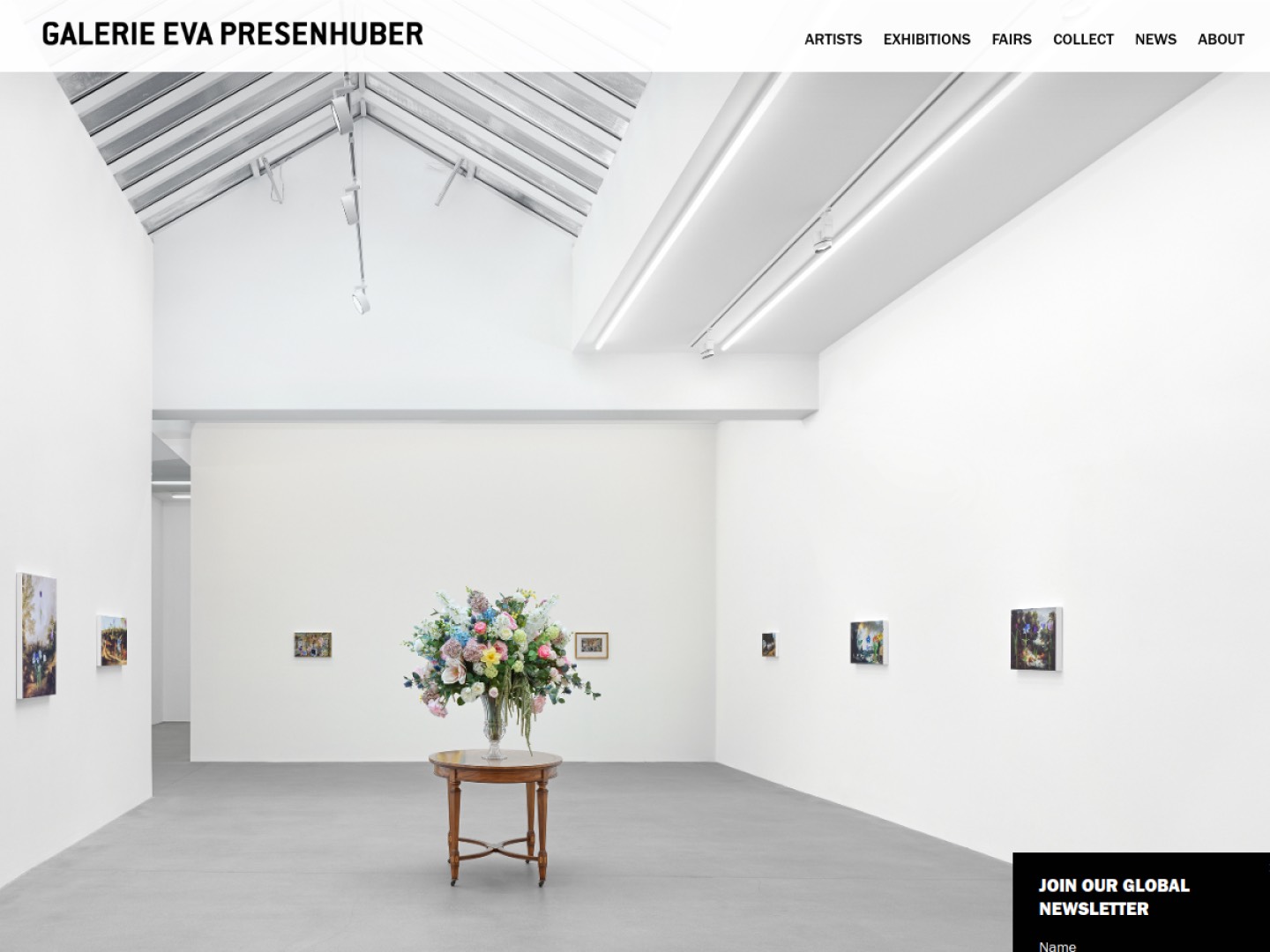
21. Galerie Eva Presenhuber: presenhuber.com
Presenhuber keeps a clean, gridded site with excellent installation photography and a straightforward structure. It handles a substantial roster while staying fast and easy to work through.
22. Stephen Friedman Gallery: stephenfriedman.com
The London gallery's site is bright, well-organized and generous with imagery. Artist pages are thorough, exhibition documentation is strong, and the navigation makes the program easy to explore.

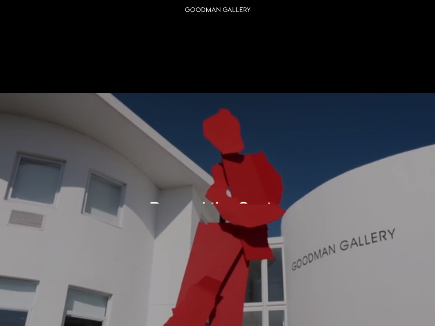
23. Goodman Gallery: goodman-gallery.com
With roots in Johannesburg and spaces in Cape Town, London and New York, Goodman Gallery uses its website to carry a program with real curatorial weight. Exhibition texts, artist archives and press give the site depth beyond its inventory.
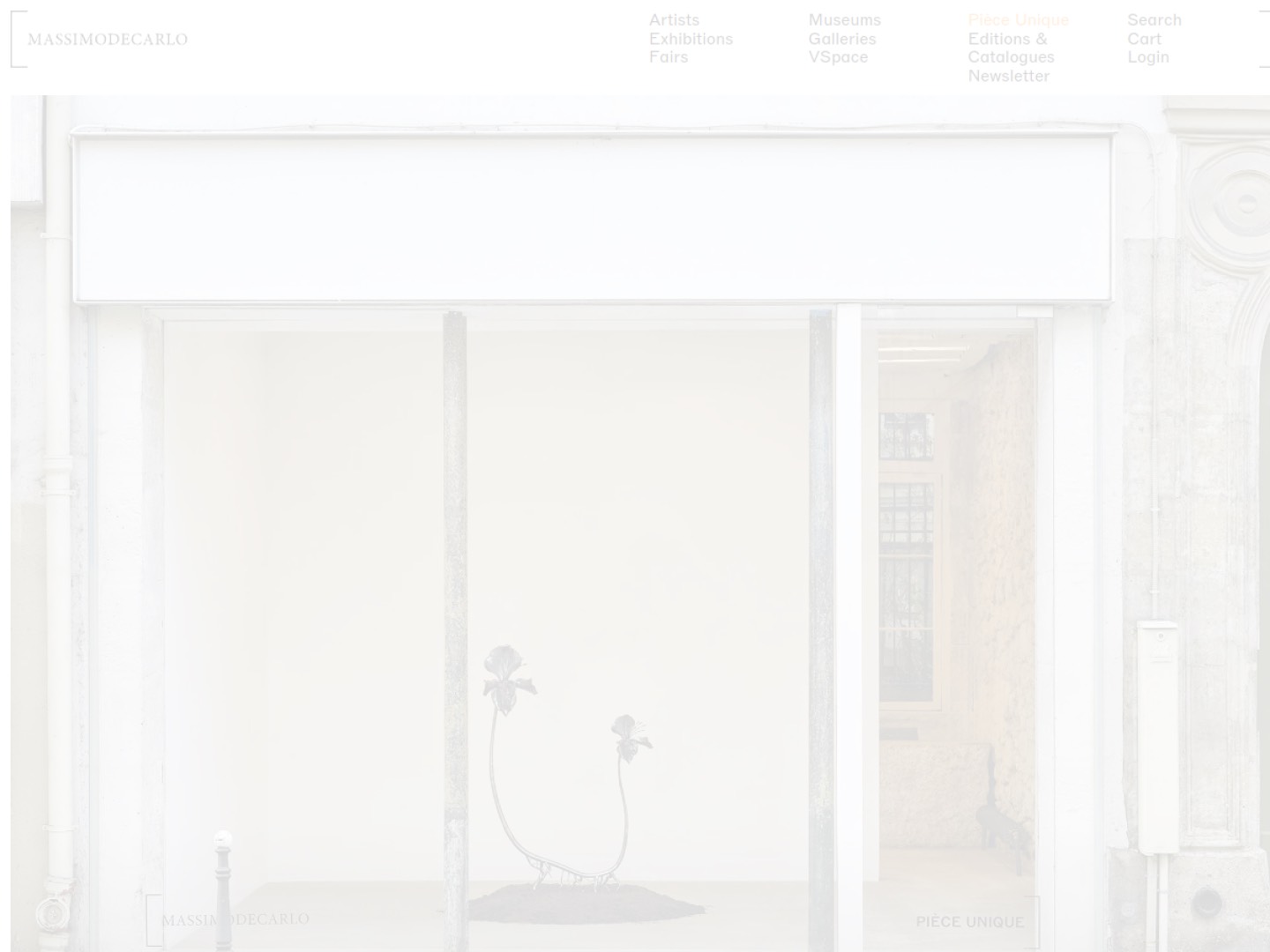
24. Massimo De Carlo: massimodecarlo.com
Massimo De Carlo has been among the more inventive galleries online, notably with its VSpace virtual viewing room that stages works in rendered interiors. The main site is clean and image-led, and the appetite for experiment keeps it a reference point for digital presentation.
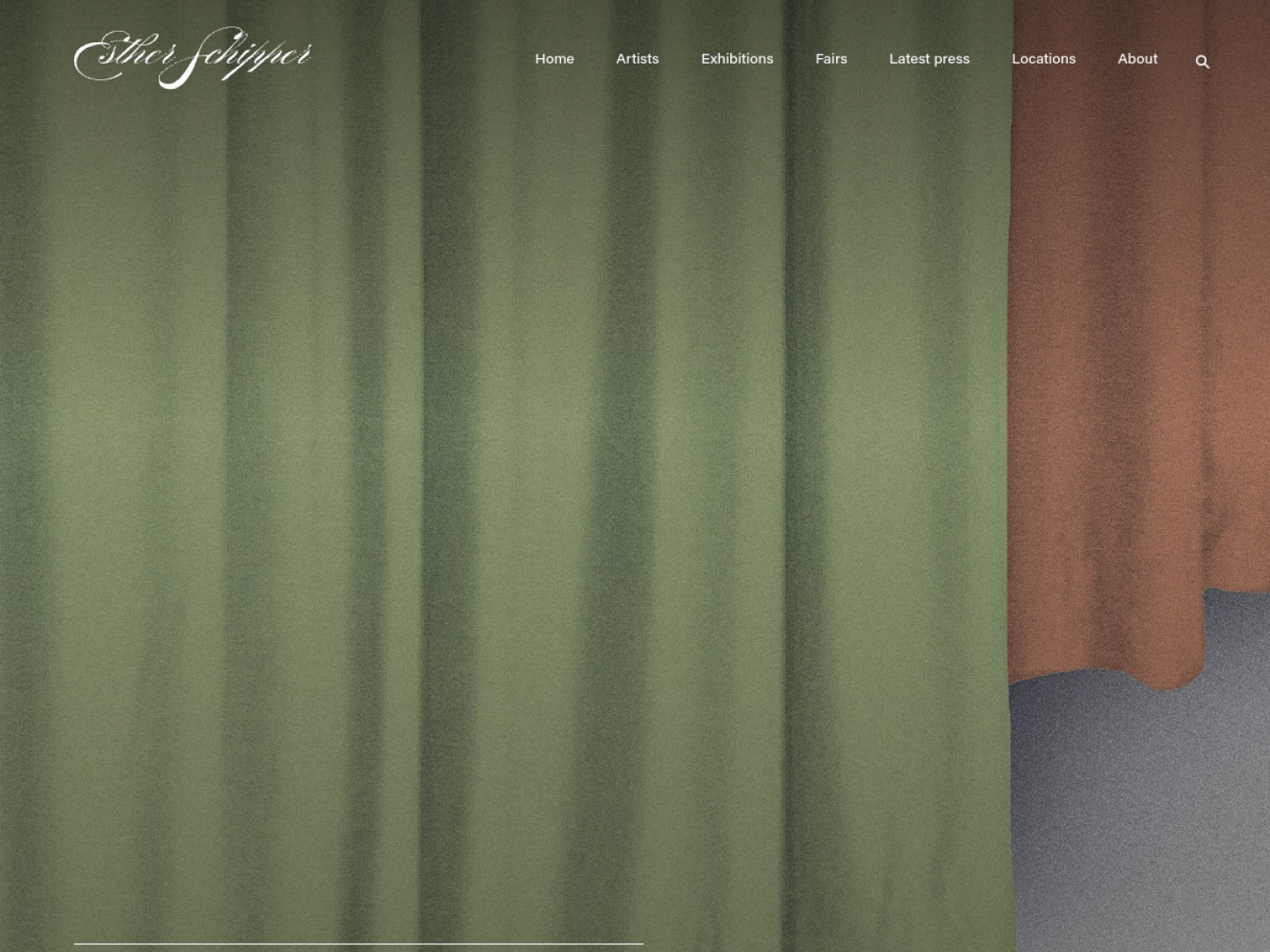
25. Esther Schipper: estherschipper.com
The Berlin gallery runs a precise, well-structured site that suits its conceptual program. Exhibition documentation is careful, artist pages are substantial, and the restrained design keeps attention on the work.
Qué hacemos the strongest gallery websites have in common
Across very different programs and budgets, the same choices keep coming up. The work comes first, with design that supports it instead of competing. Artist pages are substantial and do real work in search results and in AI answers. A viewing room or its equivalent presents available work with a clear path to inquire. Pages stay fast even when the images are large, and the phone is treated as the main screen. None of these choices require a mega-gallery budget. They require discipline and a site built to place work, not only to impress. To be found by collectors in search and in AI assistants, see our SEO service for art galleries.
Cómo Nakada Design helps
We design and build websites for galleries and dealers that hold their own against the names on this list and are engineered to convert. If you want a site that presents your program beautifully and helps place work, tell us about your gallery.
Preguntas frecuentes
The strongest gallery sites put the work first, give each artist a substantial page, present available work in a viewing room with a clear inquiry path, load quickly even with high-resolution images, and read well on a phone. Polish matters, but the sites that stand out are the ones built to turn discovery into contact.
No. Most of what makes these sites effective comes from editorial and structural discipline rather than spend: clear navigation, real artist pages, fast image-rich pages, and an obvious way to inquire. A focused smaller gallery can apply the same principles and compete well above its size.
Treat the site as a living channel. Publishing exhibitions, artist news and the occasional essay keeps collectors returning and signals to search engines and AI assistants that the gallery is active, which supports discovery. A site that changes only once a year reads as dormant.